(Disclosure: the following review is the part of the IF Comp review trades. David Neal requested that I check out his work. I played a copy of Alicewinks that I bought with my own money; other work reviewed is available for free on David’s website.)
 Alicewinks is an ebook version of Alice in Wonderland, read aloud and fully animated. The interactivity mostly focuses on mode of consumption: you can choose to read the text, flip through illustrations, or view the animations with audio — the latter option basically being a chaptered movie. The reading is pleasant to listen to, if a little less polished than some audio book performances.
The animations are made from illustrations out of many different editions of the book stitched together. The effect is a bit dizzying. Now Alice looks like a fairly young girl, and now she looks nearly grown; now she’s blonde, now brunette. Similar changes happen to the white rabbit. Sometimes the characters are made to walk or hop through a perfunctory animation of their limbs, not far off the style of Monty Python animations. Sometimes they’re squeezed or stretched to match up with elements from other illustrations. Sometimes they’re placed against backgrounds that have been upscaled or blurred to give them room for movement.
Though the individual contributing illustrations are often very beautiful, therefore, the juxtaposition and forcible animation of those illustrations is often unattractive or (at best) a bit hallucinatory. Given that it’s Alice in Wonderland, that’s not completely inappropriate.
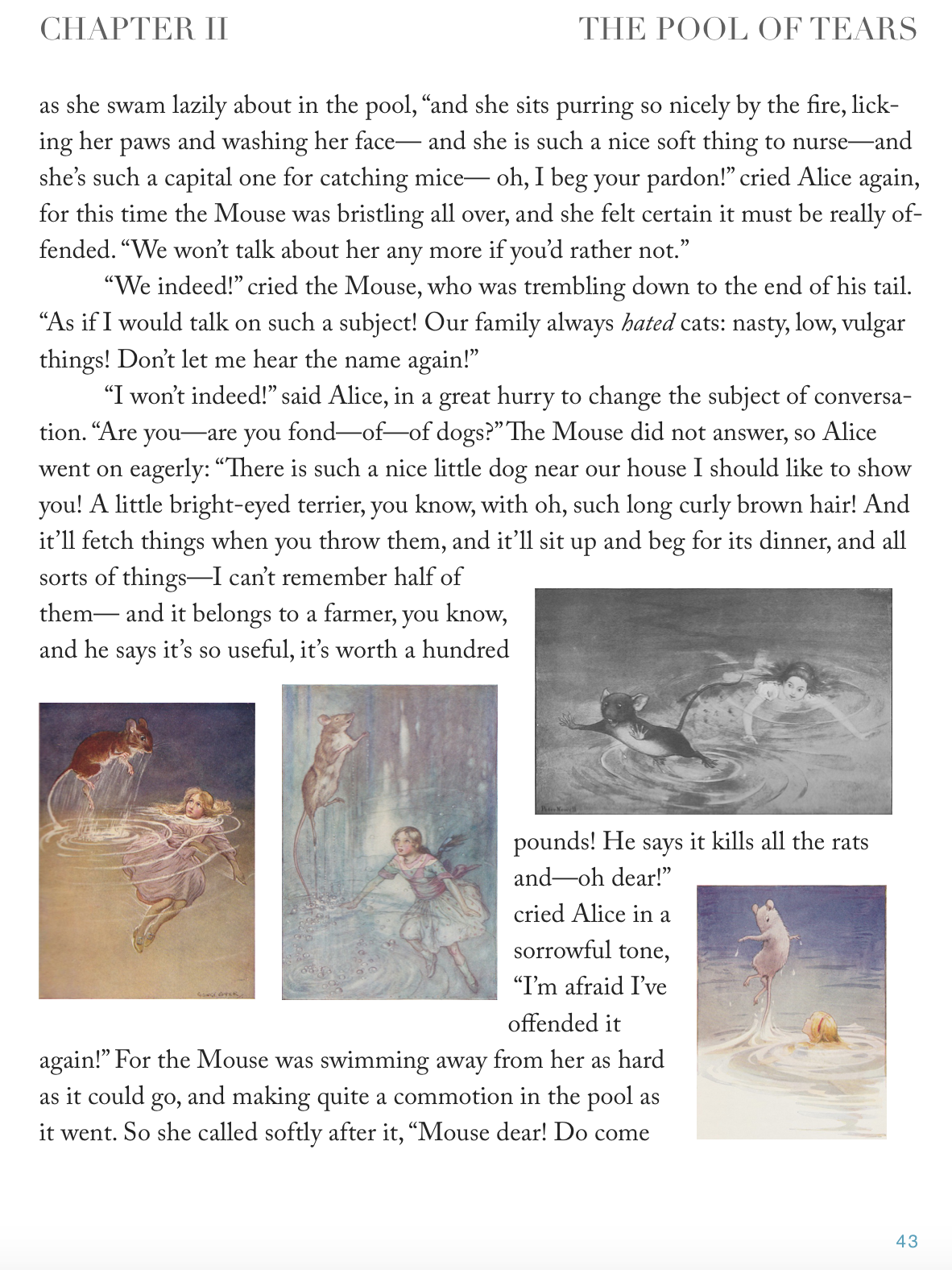 Personally, though, I preferred to see the illustrations without these animations by opting out of the video presentation. When there are multiple pictures for the same event, the text puts them next to one another. As a result, pages with particularly picturesque moments (like Alice’s encounters with a mouse as big as herself) are clustered with images, while other pages are almost all text. The text flow sometimes works and sometimes looks a little clunky wrapping around so many small pictures, but even just a quick flip through the pages is enough to distinguish the events that preoccupied artists.
 Even more fun, I thought, was to page through the attractive full-size reproductions, noting which elements were persistent and which ones came and went at the whim of the artists. The book is a collection of some really lovely classic illustrations, and it’s worth something in that regard alone.
Between the animations and the overall emphasis on these pictures, I felt like Alicewinks was trying for something it never fully attained, namely to offer a fluid exploration of the differences between these different illustration styles and artistic choices. What the ideal interactive art comparison app might look like, I admit I don’t know. Perhaps it would let the reader/player remix the art themselves. Perhaps it would provide a database letting the reader drill down into different types of images with different elements. (How many pictures are there with a bottle of some sort?)
*
Neal’s website also features a flashlight game using these same illustrations: the aim is to move a small circle of visibility back and forth over a mostly dark frame, searching for some object specified in the puzzle. I am not usually a great fan of flashlight mechanics, even when I otherwise like the game. Possibly here the idea is that, by piecing together partial evidence (“what am I seeing in this picture now? where are the major figures likely to be posed? who will be holding the pot of marmalade?”), the reader gains an interactive appreciation for the picture’s composition that might otherwise be missing.
In practice, I felt this was a fairly uncompelling. It is totally possible that small children disagree with me.
*
Don’t Find Me, I’m Not Yours calls itself a parody of Find Me, I’m Yours.
This requires a little bit of background, perhaps. Find Me, I’m Yours bills itself as “Click Lit”, and is a transmedia project in the sassy modern romance style, starring a 24-year-old woman with eccentrically painted fingernails and the hunk of her dreams. There’s an ebook you can buy, but the ebook also ties into a huge number of supporting websites. In contrast with the typical ARG approach, the websites are clearly labeled as part of the Find Me, I’m Yours story universe; and rather than hinting at sinister conspiracies or corporate coverups, they include sites for fictional shoe repair shops and ifckedup.com where fictional users have uploaded public apologies for unwise past actions. These websites themselves go quite deep, some of them containing bunches of additional content and videos.
I have not read Find Me, I’m Yours. The introductory video did not really appeal all that much: it suggested a rather thin quest arc in which the protagonist is seeking a guy she barely knows anything about in order to win him as a kind of prize. (I also didn’t like Sleepless in Seattle.)
I think it’s safe to conclude that David Neal didn’t like Find Me, I’m Yours either. Although “Don’t Find Me, I’m Not Yours” calls itself a parody, it might be closer to call it a review, since it’s often talking about itself in terms that seem to apply to its namesake:
This is not the story of a story, it is the story of a not a story. A fantasy of clicky-clacky. A seemingly unending series of saccharine (aspartame?, sucralose?) non-events interrupted by irrelevant imagery…
“Don’t Find Me, I’m Not Yours” is heavily studded with links to other websites, seemingly almost at random. The word “sucralose” there is linked to http://sucralose.org/; the word “saccharine” is linked to a youtube video. There’s a sense of free association. Possibly the links simply go to whatever was the first result of a Google search on a particular topic. In any case, the hypertext elements have become a distraction. They don’t serve as a gloss or elaboration on the text, but as ways to stop reading that text. Perhaps Find Me, I’m Yours commits the same sin.

In the app version of Alicewinks, which Apple first rejected because it was “just a movie” and later rejected because it was “just a book,” when you turned the iPad horizontal you saw two of the illustrations side-by-side for comparison. Swiping left-right on either image took you to the next illustration of that artist. Swiping up-down went linearly through the story line. So you could compare two of the same artist’s images or two images of the same scene, or even two totally random images. But, as Emily knows, apps are at the mercy of Apple, both as censor (rejecting apps) and developer (making it so apps no longer work with new releases), so I’m just as happy to have gone iBook, even though in iOS7 there was a bug such that the hyperlinks didn’t work. They did fix the bug in iOS8, and it only took them 8 months or so.
With regards the DFMINY, you seem to have missed the actual story. You clearly got the parody aspect, the textual links are indeed totally superfluous to the narrative. They come up in separate tabs (target=”_blank”). If you were to have found one of the (two) links to the narrative line, it would have stayed in the same tab. To me, one of the difficulties of the form of branching stories is that narrative is linear, and branching breaks that. Now, parallel paths (“meanwhile, back at the ranch,” as in this story) are troublesome in linear narrative. For example, in Lunation http://www.amazon.com/Lunation-Book-1-J-J-Gadd-ebook/dp/B00GBMD7XI/ JJ Gadd sends you to one chapter to follow the boy and another to follow the girl. Then you go back (or forward) to the other chapter. This is the nature of linear vs. branching type capabilities. My work eliminates the chapter linearity using, in this case separate html pages. It could also be done in a more linear fashion with a single page that used javascript to reorder the “chapters.” I think some ePub readers support javascript so that might work there. I have not tried that. DFMINY was my first (and probably last!) experiment with this form.
It does matter somewhat which path you choose through DFMINY. Whomever’s story you first choose to see, you will also get their view of the email correspondence. Those emails are the same, obviously, but you see them through the lens (email inbox) of the subject you first chose. You will miss some of the (tangential) emails that the other subject receives unless you restart and follow the other protagonist.
And, with regard to the superfluous links, I did not always take the First thing in the Google search. Sometimes I took the second or even the third! Some of the links ARE Google searches. Something like “Three Men in a Boat” most of the tangents are somehow relevant to the word that is clicked. But, as Emily rightly points out, they are, on purpose, totally tangential.
Ah, interesting. What kind of response did you get from your readers to the hidden link approach (having two useful links in a sea of useless ones)? Did a lot of them get to the later phases of the story?
There is no feedback field/page, so no formal feedback. But from Google stats, it is clear that people find the other pages. Over the years, I have found that most people tend to click on pictures rather than text.
Whoa, okay. It didn’t even occur to me to click the images of the two characters; as I look at it, there’s not a lot there to indicate that those are links rather than static elements. There are several non-linking images here, too, which helps disguise the ones that do function that way.
Maybe your readership is coming in with different expectations here, though. I also felt like the first passage was intentionally creating a hostile experience for the reader — all these things to click, most of which turned out to be unrewarding — and that that was part of your point. So when I ran out of new things to click and the story hadn’t progressed, I didn’t question very hard why there wasn’t any more.
The later passages do have a significantly different feel, where it seems like the links about the characters are actually intended to flesh out their situation a bit.
I wasn’t crazy about the implementation of the email interface because the distribution of so many short messages across many segments requires a lot of clicking relative to the small amount of information or personality offered in each email: we hardly get any sense of these people as characters, and the missed-connection plot doesn’t provide much of a conflict or story arc. But maybe that’s also part of the parodic point you’re making. More broadly, though, the database of explorable information is a productive mechanic for lots of stories (ranging from Life on Mars? in this IF Comp to Her Story or Christine Love’s stuff), and I think it works fine for delivering information of the kind you want to convey here.
As for the challenge of branching and how to cope with that when you want to create a coherent narrative arc, that’s a huge topic, but suffice it to say that I don’t agree it’s a lost cause.
Yes, you totally nailed it! Doing first page I was very angry about FMIY. You seem to have missed the fact that it is basically an advertisement for Sweet-n-Low sweetener. The company paid at least $500K to create the book and websites. And then they have the gall to charge $7 for the book! And litter the web with fabricated sites that will eventually go away when they give up throwing money at it.
So, by the time I finished the first page, my anger was gone and I realized that I had to actually write a story. I was interested to see what I could do with HTML/CSS/Javascript, I hadn’t done anything with them since I retired in 2000. Last I knew, “frames” were the big thing. (Boy, did that suck!) I did try to write the best story I could, that was not the parody. Clearly the email clicking is tedious (as, I would argue, is 99% of the IF stuff!) But, IRL one would click for each email as well. Anyway, this parodies both the IF form and the FMIY implementation.
As I say, John Barth’s “Click” was an inspiration. In part, his story follows the characters around the Baltimore harbor and inspired the use of the Google maps/street view to follow the characters. You can walk the route of Caslon to Newtown in street view. We walked that path almost every week we were in Wellington to get the 2 for 1 pizzas.
I think that if you are truthful with yourself, you will find that my parody and your criticism applies to the vast bulk of the IF out there.
As to clicking on the images, I suspect that you would be several sigmas into the tail of the curve. It would be interesting to take 10 people off the street and have them look at the first page. My guess is that a good % would click the pictures FIRST. Another big number would get to the pictures after a few text clicks, and a very small number would give up without clicking the pictures. In my first Alice (which had only text links) almost everyone I showed it to clicked on the images first thing! But also that was in 1995 on a mac or pc. Tablet/phone might be different.
Thanks for going back through this. I appreciate your opinions.