A lot of my recent work on Alabaster has been to tie together plot threads from different contributors and try construct something that produces a coherent narrative. I’m a little nervous about this process, since I’m doubtless taking some of the contributions in a direction that the contributors didn’t expect; if anyone objects wildly, we can talk it out in the beta-stage. But I think I do now have a viable, consistent story and plot structure.
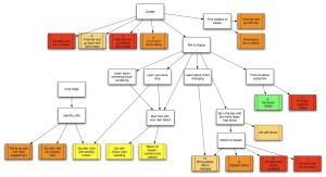
This level of organization is impossible to capture on the conversation tree, because some of the outcomes depend on other actions than conversation. So I need something else — another kind of chart — and this one can’t really be automatically generated from the game source. Here it is drawn by hand (though note that if you click through to the full thing it will necessarily be a bit spoilery):

Currently there are 18 ways the plot can end. Dashed lines indicated endings that aren’t fully implemented yet (so you can’t actually reach that outcome); a number in a box indicates that I’ve written a test command to test it. The ending test commands are named things like “end-1”, “end-2”, and so on, so one can go through and try all of them. The colors of the outcome boxes indicate how likely the player character is to survive that ending. Red endings kill you instantly; orange endings indicate that long-term prospects aren’t great; yellow endings are more optimistic. The one green ending doesn’t kill you at all, but it’s not optimal for other reasons. So the best endings from the story perspective are the yellowish ones down at the bottom center-left; they take the greatest amount of plot-traversal to reach, which (I think) is as it should be.
It’s possible that I would be able to autogenerate a puzzle and completion map if I were using Aaron Reed’s Intelligent Hinting extension. Since that explicitly tracks puzzles and the relationship between them, one might be able to create a .dot file for that as well. In fact I did a little preliminary experimentation with the idea, using Aaron’s hinted implementation of Adventure. It partly worked, but it wasn’t as clear as I would have liked; I think I was misunderstanding how he was using some of the relations. Nonetheless, that is something that could probably be done given some effort.
Something that’s always necessary to think about in a replayable plot where the player is unlikely to get the “good” outcome the first time around: how do we indicate after a failed playing what he should go back and do in order to get a better outcome?
Partly one needs to leave enough clues in-game that there are other options one hasn’t pursued, but I think a certain amount also depends on the hook-iness of the writing of the unhappy endings. They shouldn’t just be generic failures; they should be interesting failures that give enough information to reward the player for reaching even that far, while improving his understanding of the world and giving him some new directions to try once he gets back into the game. So the chart helps me think about this: in particular, a negative ending should point at the next thing the player could have done to get a more interesting outcome. Endings 1, 2, 3, and 6 could leave some hint about waking the hart. Endings 4 and 5 should suggest that there is more to know, that you didn’t find out everything from Happy after all. And so on. It’s pretty unlikely that the player will wind up hitting all the less-optimal endings before getting to the better ones, but I’m hoping that consciously structuring things this way will provide more impetus to keep going.
While it may be unlikely that any one player will hit all the less-optimal endings first, if the game gets much play, the probability that there will be one player who does indeed hit all the less-optimal endings first is actually reasonable. Accounting for the hapless in your design is always a good idea.
(You might also consider pointing at the worse endings from the good ones–both as a way to help the completist, and as a way to reward the player for being clever, even if they were unconsciously so. ‘Thank goodness you didn’t , or might have happened.’)
I’ve read the similar chart for Bronze. But in that case, what came first: the chart or the game source?
But in that case, what came first: the chart or the game source?
In that case — as here, really — I wrote part of the source, then made the chart in order to see what was happening; then worked out further design on the chart, and implemented that. So it’s a back-and-forth thing.